Instagram Reels covers have become the storefront of your content strategy. They’re the first thing viewers see when browsing your profile, and they can make or break whether someone decides to watch your video. Getting them right isn’t just about aesthetics, it’s about driving engagement, building brand recognition, and creating a cohesive visual experience that keeps your audience coming back for more.
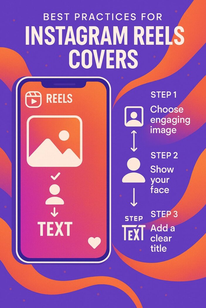
What Are Instagram Reels Covers and Why They Matter
Definition and Purpose
Instagram Reels covers are custom thumbnail images that represent your video content on your profile grid. Think of them as movie posters for your videos—they need to capture attention, convey the content’s value, and entice viewers to click play. Unlike the automatically generated thumbnails Instagram creates, custom covers give you complete control over how your content appears.
The primary purpose extends beyond simple aesthetics. These covers serve as visual navigation tools, helping your audience quickly identify and access the content they’re looking for. When someone visits your profile, they’re essentially window shopping through your covers before deciding what to watch.
Impact on Engagement and Profile Aesthetics
Well-designed Reels covers can increase your click-through rates by up to 40% compared to random auto-generated thumbnails. They create visual consistency that makes your profile appear more professional and trustworthy. This consistency builds brand recognition, viewers start associating your visual style with quality content.
Your profile’s overall aesthetic directly impacts follower retention. Users are 3x more likely to follow accounts with cohesive visual branding. Custom covers transform your profile from a random collection of videos into a curated experience that reflects your brand’s personality and professionalism.
The Psychology Behind Effective Reels Covers
Visual Appeal and First Impressions
Human brains process visual information 60,000 times faster than text. Your Reels cover has approximately 0.05 seconds to make an impression before users decide whether to engage. This split-second judgment is based on color contrast, visual clarity, and emotional appeal.
Effective covers trigger emotional responses through strategic use of facial expressions, color psychology, and visual hierarchy. Faces in covers increase engagement by 32% because humans are naturally drawn to eye contact and emotional expressions. However, the face must be clearly visible and express genuine emotion relevant to the content.
Brand Recognition and Consistency
Consistent visual elements across your covers create a recognizable pattern that viewers subconsciously associate with your content quality. This recognition reduces the cognitive load required for users to identify your content in their feeds, increasing the likelihood they’ll engage with new posts.
Brand consistency through covers builds trust and authority. When viewers see familiar design elements, they’re more likely to assume the content will meet their expectations based on previous positive experiences with your content.
Essential Design Elements for Instagram Reels Covers
Color Psychology and Brand Colors
Color choices directly influence viewer emotions and actions. Red creates urgency and excitement, making it perfect for trending topics or time-sensitive content. Blue builds trust and professionalism, ideal for educational or business content. Yellow and orange convey energy and creativity, suitable for entertainment and lifestyle content.
Your brand colors should dominate your cover palette, but accent colors can highlight important elements or create visual interest. Use the 60-30-10 rule: 60% primary brand color, 30% secondary color, and 10% accent color for optimal visual balance.
| Color | Emotional Response | Best Use Cases |
|---|---|---|
| Red | Urgency, Excitement | Trending topics, Announcements |
| Blue | Trust, Professional | Educational, Business content |
| Green | Growth, Health | Wellness, Finance, Nature |
| Yellow | Energy, Optimism | Entertainment, Lifestyle |
| Purple | Creativity, Luxury | Art, Premium content |
| Orange | Enthusiasm, Warmth | Food, Travel, Fitness |
Typography and Text Placement
Text on covers should follow the hierarchy principle: headline, subheading, and supporting text in decreasing importance. The headline should occupy the largest visual space and use bold, sans-serif fonts for maximum readability on mobile devices.
Position critical text in the center third of your cover to ensure visibility across different device screens. Avoid placing text near edges where it might be cut off by Instagram’s interface elements.
Font Selection Guidelines
Choose fonts that reflect your brand personality while maintaining readability. Bold, condensed fonts work best for headlines because they remain legible at small sizes. Script or decorative fonts should only be used sparingly for accent text, never for primary information.
Limit yourself to two font families maximum per cover design. This creates visual harmony while providing enough contrast to establish hierarchy. Sans-serif fonts like Helvetica, Roboto, or Montserrat offer excellent readability across all devices.
Text Readability Standards
Ensure sufficient contrast between text and background colors. A contrast ratio of at least 4.5:1 meets accessibility standards and ensures your text is readable for users with visual impairments. White text on dark backgrounds or dark text on light backgrounds typically provides the best readability.
Text size should be minimum 24px for headlines and 18px for body text to remain legible on mobile screens. Test your covers on different devices to verify readability before publishing.
Optimal Dimensions and Technical Specifications
Aspect Ratio Requirements
Instagram Reels covers use a 9:16 aspect ratio (vertical orientation) to match the full-screen Reels viewing experience. However, when displayed on your profile grid, they appear as 1:1 squares. Design your covers with safe zones that ensure important elements remain visible in both orientations.
Create your covers at 1080×1920 pixels for optimal quality, but design the focal point within the center 1080×1080 pixel area to ensure it displays properly in grid view.
Resolution and Quality Standards
High-resolution covers signal professionalism and attention to detail. Use minimum 1080×1920 pixels resolution to prevent pixelation when Instagram compresses your images. Higher resolutions don’t significantly improve quality due to Instagram’s compression algorithms but won’t hurt your covers either.
Maintain consistent image quality across all covers. Mixed quality levels create an unprofessional appearance that can undermine viewer trust in your content quality.
File Format Recommendations
JPEG format offers the best balance of quality and file size for most covers. Use 85-90% quality settings to minimize file size while maintaining visual quality. PNG format is only necessary when you need transparency effects or have images with sharp edges and text.
Optimize file sizes to 500KB or less for faster loading times. Large file sizes can cause covers to load slowly, potentially losing viewer attention during the brief loading period.
Content Strategy for Reels Covers
Matching Covers to Content Themes
Your cover design should immediately communicate your content’s value proposition. Educational content benefits from clean, professional designs with clear headlines that state the learning outcome. Entertainment content can use more dynamic, colorful designs that convey energy and fun.
Create visual consistency within content categories while maintaining overall brand cohesion. For example, all your tutorial covers might share similar layouts and color schemes, making them instantly recognizable as educational content.
Creating Series and Collections
Develop visual templates for recurring content series. This creates anticipation and helps viewers easily identify new episodes or related content. Use consistent design elements like background colors, fonts, or graphic elements while varying the specific content details.
Number your series covers to indicate progression and completeness. Viewers appreciate being able to consume content in logical order, and numbered covers make this navigation effortless.
Educational Content Covers
Educational covers should prioritize clarity and credibility. Use clean backgrounds, professional fonts, and minimal graphic elements that don’t distract from the learning promise. Include specific outcomes or benefits viewers will gain from watching.
Structure educational covers with a clear hierarchy: main topic at the top, key benefit or outcome in the middle, and your branding at the bottom. This format quickly communicates value while maintaining brand recognition.
Entertainment Content Covers
Entertainment covers can be more expressive and creative. Use bright colors, dynamic compositions, and emotional expressions to convey the mood and energy of your content. However, avoid cluttered designs that confuse viewers about the content’s focus.
Incorporate trending design elements or memes (when appropriate) to increase relatability and shareability. Just ensure these elements align with your brand voice and won’t appear dated quickly.
Design Tools and Resources for Creating Covers
Free Design Platforms
Canva offers extensive Instagram Reels cover templates and an intuitive drag-and-drop interface. Their template library includes designs for various industries and content types, making it easy to maintain consistency while customizing for specific videos.
GIMP provides advanced photo editing capabilities for users comfortable with more complex tools. While it has a steeper learning curve than Canva, it offers greater creative control for custom designs and advanced image manipulation.
| Tool | Cost | Skill Level | Best Features |
|---|---|---|---|
| Canva | Free/Premium | Beginner | Templates, Brand Kit |
| GIMP | Free | Intermediate | Advanced editing, Plugins |
| Figma | Free/Premium | Intermediate | Collaboration, Vector editing |
| Photopea | Free | Intermediate | Photoshop alternative |
Premium Design Software
Adobe Photoshop remains the gold standard for professional cover design. Its advanced layering, masking, and text capabilities enable pixel-perfect designs with unlimited creative possibilities. The monthly subscription includes access to Adobe Fonts and Creative Cloud assets.
Figma excels for designers who work collaboratively or need vector-based designs. Its web-based platform makes it accessible from any device, and real-time collaboration features are invaluable for team-based content creation.
Mobile Apps for Quick Creation
Over for iOS creates professional-looking covers directly on your phone using AI-powered design suggestions. Upload your content screenshots, and the app generates multiple cover options based on current design trends.
PicsArt offers comprehensive mobile editing tools including background removal, text effects, and filter applications. Its community features let you discover trending design elements and get inspiration from other creators.
Brand Consistency Across Reels Covers
Establishing Visual Identity
Your visual identity encompasses more than just colors and fonts—it includes the overall mood, style, and personality conveyed through your covers. Develop a mood board that captures your brand’s essence, then use it as a reference for all cover designs.
Consistency doesn’t mean identical designs. Instead, establish flexible guidelines that allow creativity while maintaining recognizable brand elements. This might include consistent color palettes, typography choices, or compositional styles.
Color Palette Implementation
Develop a primary color palette of 3-5 colors that represent your brand’s personality and values. Use these colors consistently across all covers, varying their proportions and applications to prevent monotony while maintaining brand recognition.
Consider seasonal or campaign-specific color variations that complement your primary palette. This allows for timely relevance while preserving brand consistency. Document your color codes (hex values) to ensure precise matching across different design tools.
Logo and Branding Elements
Your logo should appear consistently on covers without overwhelming the design. Position it in the same location across all covers, typically bottom right or as a watermark—to build subconscious brand recognition.
Develop simplified versions of your logo for small-scale use on covers. Complex logos may become illegible when scaled down, so create a simplified icon or wordmark specifically for cover applications.
Text and CTA Optimization for Reels Covers
Compelling Headlines and Hooks
Your cover headline should create curiosity while accurately representing your content. Use action words and specific benefits to entice viewers. “Learn” is less compelling than “Master” or “Discover.” Numbers and time frames add specificity that increases click-through rates.
Question-based headlines engage viewers by addressing their specific problems or interests. “Struggling with Instagram Growth?” immediately identifies your target audience and implies a solution within the content.
Call-to-Action Best Practices
Subtle CTAs work better than aggressive sales language on covers. Phrases like “Watch Now,” “Learn More,” or “See Results” encourage engagement without appearing pushy. The CTA should complement your headline, not compete with it for attention.
Position CTAs strategically within your design hierarchy. They should be visible but secondary to your main headline. Use contrasting colors or design elements to make CTAs stand out without overwhelming the overall composition.
Testing and Analytics for Cover Performance
A/B Testing Strategies
Test different cover versions for similar content to identify which design elements drive higher engagement. Focus on one variable at a time, color scheme, headline text, or image composition—to isolate what influences performance.
Create systematic testing schedules rather than random experiments. Test covers for at least one week to account for varying audience activity patterns throughout the week. Document your results to build a database of effective design principles.
Measuring Cover Effectiveness
Track metrics beyond just views to understand cover performance. Monitor completion rates, saves, and shares to gauge whether your covers accurately represent content quality. High click-through rates with low completion rates may indicate misleading covers.
Use Instagram Insights to analyze which covers generate the most profile visits and follows. These metrics indicate covers that successfully convert viewers into engaged followers, which is often more valuable than single video views.
Common Mistakes to Avoid
Design Pitfalls
Overcrowded covers confuse viewers and reduce click-through rates. Stick to one primary message per cover and use white space strategically to guide attention. Every element should serve a specific purpose in communicating your content’s value.
Inconsistent sizing or positioning of text and graphic elements creates an unprofessional appearance. Develop templates with consistent spacing, alignment, and proportions to maintain visual harmony across all covers.
Content Misalignment Issues
Misleading covers damage trust and reduce long-term engagement. Ensure your cover accurately represents your content’s topic, tone, and value. Clickbait tactics may increase initial views but harm your reputation and algorithm performance.
Failing to update covers for evergreen content can make your profile appear outdated. Refresh covers periodically to maintain relevance and take advantage of improved design skills or trending visual styles.
Advanced Strategies for 2025
Trend Integration
Stay current with design trends while maintaining brand consistency. Incorporate trending color combinations, typography styles, or layout concepts that align with your brand personality. However, avoid trends that contradict your brand values or audience expectations.
Monitor successful creators in your niche to identify emerging visual trends. Adapt these trends to fit your brand rather than copying them directly. This approach keeps your content fresh while maintaining uniqueness.
AI Powered Design Elements
Leverage AI tools for rapid cover creation and optimization. Tools like Midjourney or DALL-E can generate unique background images or graphic elements that would be expensive to create traditionally. However, ensure AI generated elements align with your brand and don’t appear generic.
Use AI powered color palette generators to discover harmonious color combinations that complement your brand colors. These tools can suggest unexpected combinations that maintain visual appeal while expanding your creative options.
Platform Updates and Future Considerations
Instagram continuously evolves its algorithm and interface, potentially affecting how covers display or perform. Stay informed about platform updates through official Instagram creator resources and adapt your cover strategy accordingly.
Consider how your covers will appear across different Instagram features—Reels tab, Explore page, and profile grid may display covers differently. Design with flexibility to ensure effectiveness across all placements.
Prepare for potential new features like interactive cover elements or dynamic thumbnails. While these may not be available now, designing modular covers that could accommodate new features positions you for quick adaptation.
Conclusion
Creating effective Instagram Reels covers requires balancing creativity with strategy, brand consistency with trend awareness, and aesthetic appeal with functional clarity. The best covers serve as both art and advertisement, they’re visually compelling while accurately representing your content’s value.
Success comes from understanding your audience’s needs, maintaining consistent brand elements, and continuously testing and refining your approach. Your covers are often the first impression potential followers have of your content, so invest the time and effort to make them count.
Remember that great covers support great content, not replace it. Focus on creating valuable, engaging Reels while using strategic cover design to ensure your excellent content gets the attention it deserves. The combination of compelling covers and quality content creates a powerful synergy that drives sustainable growth and engagement.
Frequently Asked Questions
How often should I update my Instagram Reels covers?
Update covers when they no longer accurately represent your content, when your brand evolves, or every 6-12 months to keep your profile looking fresh. Consistency is more important than frequent changes, so only update when there’s a strategic reason.
Can I use the same cover design template for all my Reels?
While using templates ensures consistency, varying elements like headlines, images, and colors prevents your profile from looking repetitive. Create 3-5 template variations within your brand guidelines for optimal balance.
What’s the ideal text-to-image ratio for Reels covers?
Text should occupy no more than 30% of your cover’s visual space to maintain readability while allowing imagery to create emotional impact. Prioritize one strong headline over multiple text elements for maximum clarity.
Should I include my face in every Reels cover?
Including faces can increase engagement by up to 32%, but it’s not necessary for every cover. Use faces when they add value—showing emotion, building personal connection, or demonstrating results. Educational or product focused content may benefit more from other visual elements.
How do I know if my Reels covers are working effectively?
Monitor your Instagram Insights for metrics like reach, profile visits, and follower growth after posting. Compare performance between different cover styles to identify what resonates with your audience. High saves and shares often indicate covers that accurately represent valuable content.
- What is One Challenge in Ensuring Fairness in Generative AI: The Hidden Bias Problem - August 15, 2025
- How Small Language Models Are the Future of Agentic AI - August 15, 2025
- What Are the Four Core Characteristics of an AI Agent? - August 15, 2025